2020 Elections
The 2020 election was a hard one to design for. Covid pushed a lot of voting to mail-in ballots, which meant slower counts and later calls than usual. We were showing millions of people a result that didn't exist yet, on a page many of them refreshed every few minutes.
The same system had to carry the presidential race, the Senate, the House and state contests, each a different shape with a different level of detail people wanted from it.
Role
Design lead
Keywords
Data visualization, live data
Date
Q1-Q4 2020

The presidential race is a national map with electoral math on top. The Senate was 35 individual contests. The House is hundreds at once, too many to show one at a time. State races are local, and people arrive already knowing what they came for.
It also had to work across time. Before the election it was polls and forecasts. On the night it was live counting and calls arriving. Afterwards it was final numbers, recounts and challenges, which in 2020 ran for weeks.
The components stayed the same. What changed was what a number meant. A percentage was a poll in October, a partial count on election night, and a certified result weeks later. The design had to make clear which one you were looking at.

Timelapse of the live experience during election night. Timeline on the right links to the article which became the most visited article of the year.
The full Election Center: presidential, Senate, House and state, with live updates running alongside.
On a phone, the same system works on pre-election and election night.
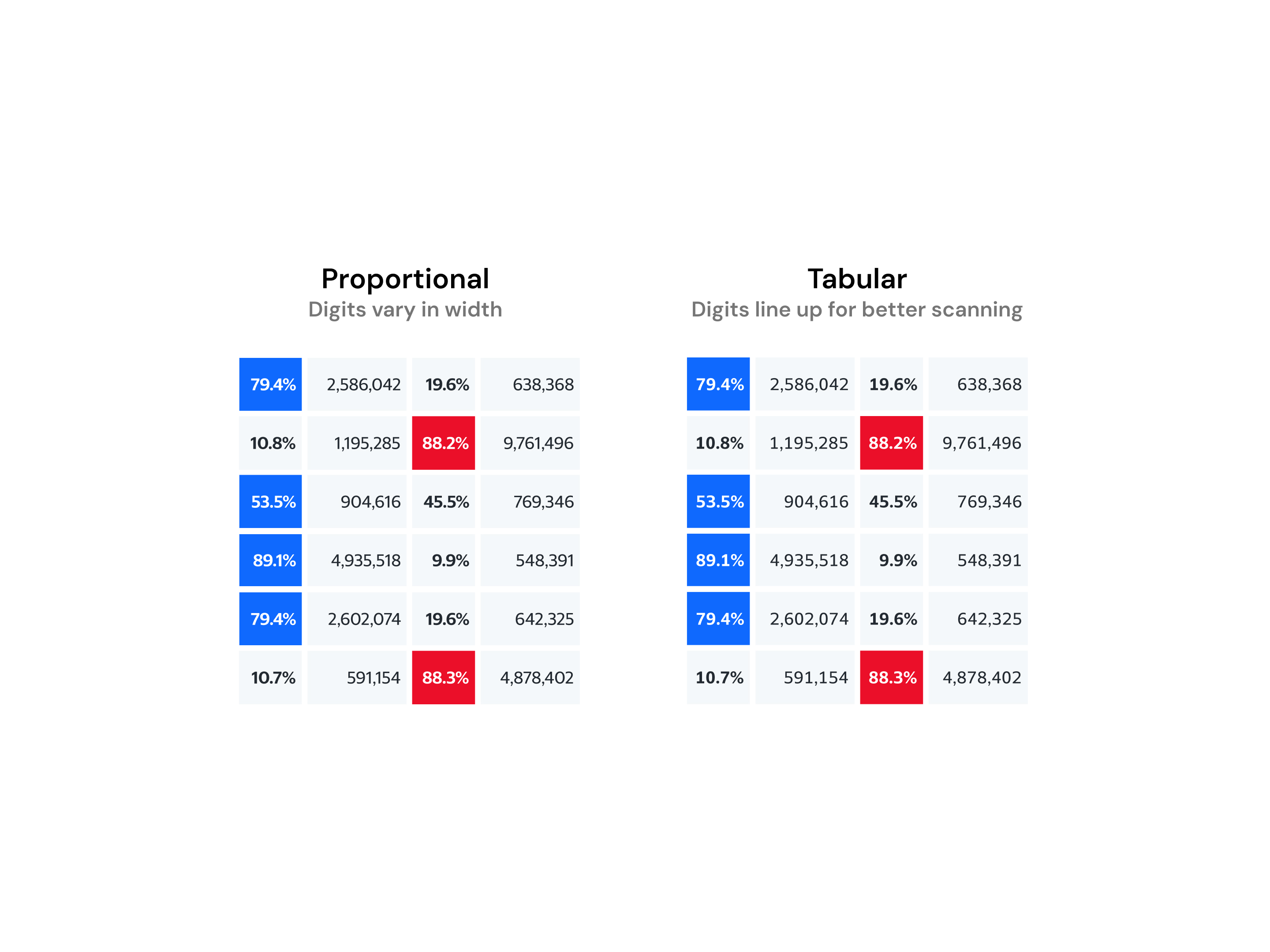
Regular typeface comes with proportional numbers, where each digit varies in width and it works well with the alphabets.
However in complex tables, I've switched to tabular numbers in order to create clean scan line for so a reader can compare rows at a glance.
The interactive map has 1.3 billion clicks from 13.8 million people.
143M page views from 14M unique visitors over six days, averaging 4M a day.
The most visited article of the year came off this page.
It set the foundation for the elections that followed.
Next project: Weather app
Design work and portfolio site made by Cat Tai